JPay
Role
I worked as a UX/UI Designer at Aventiv on the JPay Mobile app to improve the “Forgot Password” experience. My goal was to make the process faster, clearer, and more secure for users who needed to regain access to their accounts. By simplifying the steps and reducing confusion, I helped users reset their passwords with less stress while still meeting security requirements.
Challenge
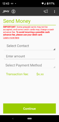
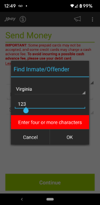
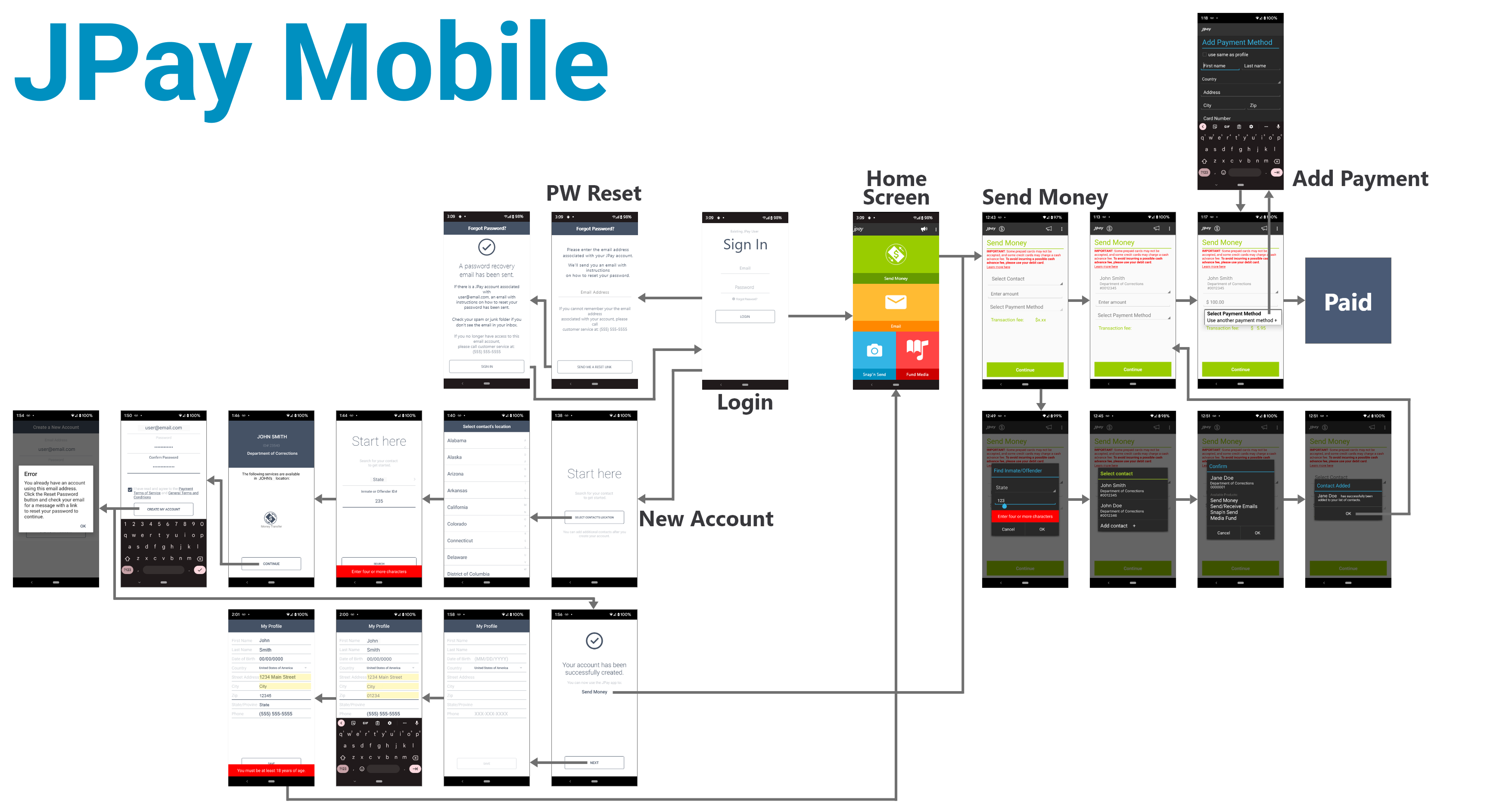
The JPay Mobile app lets users send money to incarcerated individuals. Many users reported an error saying their email was already in use.
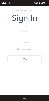
The problem happened when users forgot their password. Instead of choosing “Forgot Password,” they accidentally tried to create a new account. This caused confusion and blocked access.
The mobile design did not clearly show when users were in the account creation flow. Important labels and visual cues were too small or missing, making it hard for users to know what step they were on.
As a result, users became frustrated and could not quickly access their accounts.
Solution
In collaboration with the project manager I mapped the existing app with a user flow to find anything that might confuse or frustrate users.
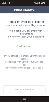
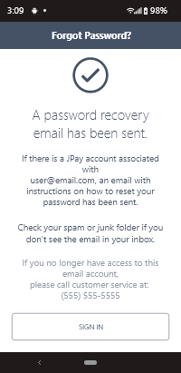
Then, I redesigned "Forgot Password" to look different from "New Account" by adding a colored label with text at the top of those screens.
This resulted in a 42% decrease in forgot password support calls.
User Flow
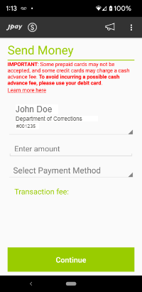
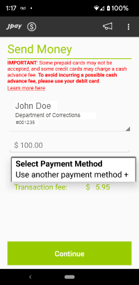
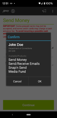
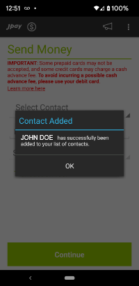
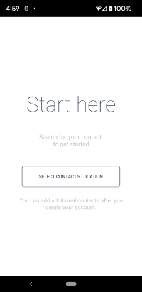
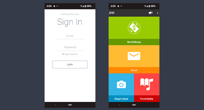
Screenshots